The 10 Most Unflattering Portraits Ever Made and the Stories Behind Them

The 10 Most Unflattering Portraits Ever Made and the Stories Behind Them

Alexander Meddings - December 21, 2017

For as long as we’ve made art, we’ve made portraits. And for as long as we’ve made portraits, we’ve made unflattering portraits. Whether because of an artistic off-day, a stylistic mismatch, or simply a hideous subject (sorry Habsburgs), even the greatest artists have rendered their subjects in ways that have shocked, offended or—worst of all—made their viewers fall about laughing. And that’s just the greatest artists.

Nowadays we don’t have this problem. With the invention of photography, we no longer need to stand before a portrait artist or sit in sessions for hours on end so they can try to capture something of our likeness. We still have the option. But for those wanting instant gratification there are either our phones, cameras, or those caricature artists you always see sitting around famous historical monuments. And, of course, when it comes to the dissemination of our image, for better or for worse we have the Selfie.

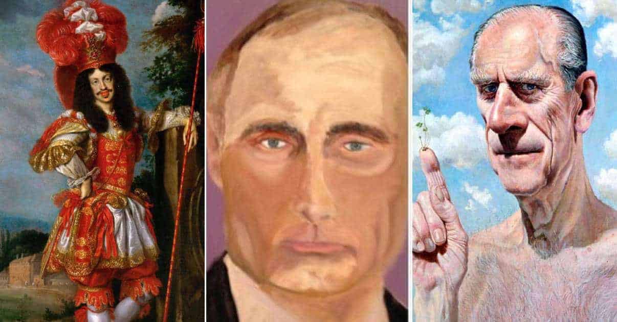
Every historical age has produced its fair share of hilarious portraiture. From the hapless Habsburgs (sorry again Habsburgs) and the demonic Danish Royal Family to former president George Bush’s woeful rendition of Vladimir Putin (so bad it’s a miracle it didn’t trigger World War Three), here are 10 of the most heinously unflattering portraits in history.

Ferdinand II of Spain by Michel Sittow

Right, plenty to get through, and no better place to start than with this unflattering portrait of Ferdinand II. Not to be confused with the Holy Roman Emperor Ferdinand II (though he didn’t fare particularly well in his portraiture either; his trademark Habsburg Jaw meaning that he rather resembled a sausage), Ferdinand II was the King of Sicily, Aragon, Castile, Naples and Navarre.

Which might explain why he looks so very tired.

The 10 Most Unflattering Portraits Ever Made and the Stories Behind Them
Ferdinand II of Spain by Michel Sittow (late fifteenth / early sixteenth century). Wikimedia Commons

There’s no evidence that he was a drinker—on the contrary, he was a devout Catholic. But from the tint of his eyes you’d be forgiven for thinking he’d been smashing the sauce the night before. Or that he’s channelling the Antichrist (which, in the eyes of the Moors, he may well have been). The early part of his reign was characterised by brutal fighting and forced conversions in Moor-held Spain. He was ruthlessly effective though, bringing to a close the several-century long period known as the Reconquista.

Ferdinand is most famous for patronising the Age of Discovery. It was he and his wife Isabella I who funded the expeditions of Christopher Columbus. We don’t know when this unflattering portrait was made, but considering he died in 1516 aged 63 we can reasonably guess it was sometime during this time in the late fifteenth century. He had a rather famous son-in-law, Henry VIII of England, with whom Ferdinand allied himself against the French and who, as we shall see in the next item, had his own fair share of unflattering portraits.

The 10 Most Unflattering Portraits Ever Made and the Stories Behind Them
Michel Sittow’s other portraiture: a woman identified as Catharine of Aragon on the left and a traditional Madonna and Child on the right. Wikimedia Commons

What makes the portrait so strange is that Michel Sittow was actually a very accomplished artist. As you can see from two of his works above (one identified as Catherine of Aragon; the other a traditional Madonna and Child), he had no difficulty rendering his subject in a realistic light. Plus unlike almost every other artist of the age, he knew how to paint babies as babies. Not as muscular little men with baffling six-packs and receding hairlines.

The 10 Most Unflattering Portraits Ever Made and the Stories Behind Them
Henry VIII engraved by Peter Isselburg after a portrait by Cornelis Metsys (c. 1548). Wikimedia Commons

Henry VIII by Peter Isselburg and Cornelis Massys

Henry VIII’s portrait by Hans Holbein the Younger is perhaps the iconic image of monarchical power. Universally recognisable, it’s a remarkable piece of propaganda that shows the king at his most mighty and imposing; a British Bulldog of a man who, if it weren’t for the clothes, wouldn’t look out of place in a modern-day Yorkshire pub.

And it is largely thanks to Holbein that we know that Henry VIII did not in fact look like a King Edward potato.

Well, at least not early in life. But this is far the impression given by Cornelis Massys’s unflattering portrait. Later engraved by Peter Isselburg, the it portrays the Tudor monarch as if he’s struggling to do his very best Mr Burns impression. The one saving grace is that we can be sure that Henry VIII never set eyes on the work because he died the year before its completion. Otherwise it may well have been off with their heads.

As well as the subject of unrealistic portraits, Henry was also the recipient. In 1539, three years after beheading his second wife, Anne Boleyn, and two year after losing his third wife, Jane Seymour, to postnatal complications, Henry decided enough time had passed to make another woman the luckiest in the kingdom. Fortune fell to Anne of Cleves, an alliance with whose family Henry and Thomas Cromwell believed was much needed for isolated, Reformation England.

The 10 Most Unflattering Portraits Ever Made and the Stories Behind Them
Anne of Cleves by Hans Holbein the Younger (1539). YouTube

The king sent his most trusted artist, Hans Holbein the Younger, to Cleves so he could see what the woman he was to marry looked like. The result didn’t disappoint; Holbein brought back a pretty, demure-looking young girl with blonde hair and slight features. A treaty was signed on October 4 1539 and within weeks Anne was on a ship en route to England.

Her arrival on New Year’s Eve wasn’t quite the fanfare some may have been expecting. Having come to greet her in disguise, upon setting eyes on her Henry exclaimed, “I like her not! I like her not!” Indeed, through a clever use of angle Holbein had discreetly masked her large hooked nose, and through a clever use of lighting had covered up her smallpox marked skin. Luckily for Anne, the marriage was annulled within six months.

The 48-year-old king was hardly one to criticise over appearance. Once a strapping, handsome young man, Henry had suffered a severe leg wound in a jousting accident in 1536 which made physical exercise impossible. Because the wound aggravated a previous one, doctor’s found it impossible to treat. And so it festered throughout the rest of his life—an ulcerated gash that, combined with other gout-caused pus-filled boils on his body, made for a sorry sight. And an even worse smell.

The 10 Most Unflattering Portraits Ever Made and the Stories Behind Them
Leopold I by Benjamin Block (1672). Wikimedia Commons

Leopold I by Benjamin Block

The undisputed glamour boy of the Holy Roman Empire, Leopold I spent half of his reign waging wars against the Ottomans and the French and the other half looking fabulous.

Not to be confused with Leopold I of Belgium (the monarch who fought side by side with his soldiers during the First World War), Leopold I was a member of the Habsburg Dynasty. Despite his imperial legacy—and the rather loud armour he’s donning in the portrait—he shied away from military life, dedicating his time to music, hunting, riding, and ruling as an absolute monarch.

The artist, Benjamin Block, came from a family of painters. Both his brothers were painters, as was his father Daniel. (Some might have described him as a chip off the old Blok).

Even his wife, Anna Katharina Block, was a painter, though she was more famous for painting flowers than monarchs. He was a remarkably talented one too, and we know the emperor Leopold was happy this seemingly unflattering portrait because he rewarded Benjamin with a knighthood in 1684. Benjamin lived six years a sir before dying aged 59 in the German city of Regensburg.

The 10 Most Unflattering Portraits Ever Made and the Stories Behind Them
Coin issue from 1670 depicting Leopold I on the obverse. Wikimedia Commons

One distinctive family feature that stands out from the unflattering portrait is the Habsburg Jaw. Few displayed it quite as prominently as Leopold; a coin type minted in 1670 portrayed it as so large that the emperor gained the not particularly flattering nickname, “The Hogmouth” (about his face, but presumably not to it).

And what was the reason for the Habsburg’s protuberant jaws? What other than lots and lots of inbreeding.

At the beginning of reign of Leopold I (1658 – 1705), the Habsburgs ruled over a vast empire comprising what are now Germany, the Netherlands, Belgium and Spain. A lot of this was because over the centuries they had managed to secure expedient marriage alliances with other powerful families. Like other royal families, however, they also had no issue breeding among themselves.

The 10 Most Unflattering Portraits Ever Made and the Stories Behind Them
Charles V by an unknown Flemish artist (c. 1515). Wikimedia Commons

The Habsburgs were more hapless than other European dynasties when it came to inbreeding problematic traits. Epilepsy, gout, depression and dropsy were shared characteristics, making family Christmases fraught affairs. But the most conspicuous result of all this inbreeding was the Habsburg Jaw. Poor Charles V (1519 – 1556) had it so bad that he had problems eating, talking and presumably giving orders to the forces under his command against the pesky Ottomans. Life was hard for Charles; exhausted after 40 years on the throne he abdicated to a monastery where he died two years later.

The 10 Most Unflattering Portraits Ever Made and the Stories Behind Them
Leopold I by Jan Thomas (1667). Wikimedia Commons

…and again, by Jan Thomas

Before you ask, yes there is context.

As touched upon in the previous item, Leopold was a very educated monarch. From an early age, he combined his deep learning in history, languages, the natural sciences and music with a devout sense of duty to his empire. But he was also rather insecure, eager to use any public occasion to enhance both his own personal prestige and the prestige of Vienna as a worthy imperial residence. He would often hold theatrical productions at the palace in which both he and his wife would take part themselves.

As well as a few productions the emperor had written himself, Italian ballets and operas were given priority as these were considered the most sophisticated. And it’s in the role of the character of one of these—Acis from “La Galatea”—that the Holy Roman Emperor is posing in the portrait above.

And doesn’t he just look fabulous.

We know that Leopold commissioned Jan Thomas to do these portraits of him and his wife, Margaret Theresa, for the occasion of their marriage in 1666. And these weren’t even the weirdest portraits Jan Thomas produced during his long and illustrious career (see below).

The 10 Most Unflattering Portraits Ever Made and the Stories Behind Them
Gundakar, Prince of Dietrichestein, by Jan Thomas (1667). Wikimedia Commons

A Turkish traveller once described Leopold as “a cultivated man of extreme ugliness”. It’s not hard to see why a Turk might have taken that view. Leopold was actually a phenomenally successful monarch, transforming Austria into a European power by the end of his reign. He never really needed to involve himself with military matters because he had such an adept general, Prince Eugene of Savoy, who can largely be credited for liberating Hungary from Turkish rule at the very end of the seventeenth century.

Leopold was clearly very pleased with Thomas’s portrait because he kept him on at the imperial court. Up until 1960, the portrait’s whereabouts was pretty much unknown as it belonged part of a private collection (presumably as an object of great amusement). In 1960, however, the painting was bought by the Kunsthistorisches Museum where is has been on display ever since (still as an object of great amusement).

The 10 Most Unflattering Portraits Ever Made and the Stories Behind Them
Gaspar de Craye Philip IV. 1628. Metropolitan Museum of Art

King Philip IV of Spain by Gaspar de Crayer

It shouldn’t come as a surprise that the historical records for this particular historical episode are lost. But from the surviving portraits we can at least try to reconstruct it.

Wanting a serious, military portrait of himself, King Philip IV of Spain dressed up as cuirassier and stood for a number of modelling sessions with Gaspar de Crayer. In fact he wore Flemish cavalry armour, specially designed for parade but uncomfortably reminiscent of a Tiger fancy-dress costume made of brass. But all that aside, he got the portrait.

Then, deciding that the serious stuff was out the way and he could kick back, Philip would have asked (or rather demanded) that Gaspar de Crayer painstakingly paint the same portrait again. Only this time with his court dwarf standing by his side.

Whether to draw attention to his height or because the dwarf was a favourite of Philip we’ll never know. We can only hope this wasn’t meant to be serious, and that Philip wasn’t in fact so insecure that he had to stand beside an actual dwarf to feel suitably regal.

The 10 Most Unflattering Portraits Ever Made and the Stories Behind Them
Philip IV with court dwarf. Gaspar de Crayer. Wikimedia Commons

It’s possible he did. On the throne from 1621 – 1665, Philip IV presided over Spain during its slow decline as a world power. Philip’s Spanish Empire had just cut itself loose from the costly Thirty Year War. And despite being geographically extensive, size wasn’t everything; in fact it hindered the growing domestic and military issues (not to mention the threat from the French) that Philip struggled with in his final years.

The 10 Most Unflattering Portraits Ever Made and the Stories Behind Them
Philip IV by Diego Velázques (1656). Wikimedia Commons

Indeed, unlike his the wines that continue to grow so abundantly in his region, neither poor Philip nor his portraits improved with age. Even one of the pioneering painters of the Spanish Golden Age, Diego Velázques, couldn’t shroud his subject in a real aura. Philip was 51 when Velázques painted him in 1656, but you’d be forgiven for thinking it was made in the last year of his reign (1665). Then again, considering the state of his country during the later part of his reign, this might not need that much explaining.

The 10 Most Unflattering Portraits Ever Made and the Stories Behind Them

Engraved portrait of Elizabeth I by William Rogers after a drawing by Isaac Oliver (c. 1592). Wikimedia-Commons

Elizabeth I by… well quite a few people

A fair few artists tried to capture the formidable nature of Henry VIII and Anne Boleyn’s daughter, Elisabeth I. And a fair few succeeded. The Armada Portrait, by an unknown artist, presents Elisabeth as both the demure Virgin Queen and the scourge of the Spanish Armada, resplendently dressed and resting her hand upon a globe. Then there was Isaac Oliver’s Rainbow Portrait, painted around 1600 (three years before her death aged 69) but depicting her as youthful, beautiful and eternal.

Then there were those that tried their hand but, whether through a lack of attention to realism or too much of it, failed to capture last Tudor monarch in the best light. The engraver William Rogers had a good go. But he could do little better than produce what looks like a regal corpse, barely held upright by the bulbous dress ballooning out of her from both sides. Then again, he was the first Englishman to try his hand at engraving so we should probably cut him some slack.

The 10 Most Unflattering Portraits Ever Made and the Stories Behind Them
Elizabeth I by an unknown artist (c. 1590). National Portrait Gallery

Even less flattering is the frankly terrible portrait above. The fault of the artist was not to be true to form in rendering the aged Elizabeth. Nor was it to allow his work to be ravaged by the sands of time (a great deal of paint is missing from the face and clothes), which he couldn’t have reasonably helped anyway. Where the artist went wrong is that he was using an entirely different model when he started the portrait, as seen by the face just visible where the paint has faded from Elizabeth’s forehead. Oh, and he made Elizabeth look an extra in the Walking Dead.

The 10 Most Unflattering Portraits Ever Made and the Stories Behind Them
Allegorical portrait of Elisabeth I created after her death (c. 1610). Wikimedia Commons

But that absolutely pales into comparison when seen against the allegorical portrait of Elizabeth above. A Japanese academic has recently argued that this portrait, composed after Elizabeth’s death during the Jacobean Period, is not in fact portraying her negatively. By playing around with conventional themes “Dance of Death”, “Triumph of Death” and “Triumph of Time”, he argues, the painter made the portrait so ambiguous and complex that it could be viewed as a positive, endorsing portrait of the queen looking .

I’m going to call this one out. It was commissioned under Elizabeth’s successor James I whose mother, Mary Queen of Scots, Elizabeth had had beheaded. There may not have been any signs of outright animosity between him and Elizabeth, but I fail to see why he would go out of his way praise her in portraiture, particularly when said portraiture featured a representation of Elizabeth with death literally standing over her shoulder.

The 10 Most Unflattering Portraits Ever Made and the Stories Behind Them
Queen Elizabeth’s portrait beside that of her painter, Lucian Freud. Every Painter Paints Himself

Elizabeth II by Lucian Freud

Elizabeth I of England certainly had her fair share of unflattering portraits. But as one of the most depicted women in the world, the current Queen of England, Elizabeth II, hasn’t fared particularly well either. In 2000, the long-reigning monarch agreed to be painted by the late Lucian Freud, a British painter who throughout his career has earned wide respect both at home and abroad.

While not remotely painful, the many, many sessions, spread between May 2000 and December 2001, were certainly long and drawn out. Freud felt obliged to assure Her Majesty that despite his seemingly slow progress he was actually going at 90 miles per hour, and if he went any faster he just might crash. And this was just to produce a portrait measuring just 9″ by 6″, capturing the head, the shoulders and—her universally recognisable party piece—the diadem.

The 10 Most Unflattering Portraits Ever Made and the Stories Behind Them
Queen Elizabeth modelling for Lucian Freud in 2000. National Portrait Gallery

It’s worth stressing here that just because it’s unflattering doesn’t necessarily make it a terrible portrait. I personally rate Lucian Freud—partly because I genuinely like his work and partly because everybody else in this country ranks him among Britain’s finest figurative painters. It might not be flattering, but it certainly captures the weariness that must come with the amount of experience Elizabeth has had during her decades in office.

Plus flattery was never one of his objectives as an artist. In fact Freud is famous for not pulling his punches when it came to depicting his subjects in a realistic light. No matter how difficult it might be to stomach, Freud saw his art as “a truth telling exercise” and saw it his role as an artist to convey this truth. If you need to see how far he was willing to go, just look at his own self-portrait below.

The 10 Most Unflattering Portraits Ever Made and the Stories Behind Them
Lucian Freud Self Portrait (1993). Gallery Intell

Freud’s work certainly divided opinion. Praise was forthcoming from The Times‘ art critic Richard Cork, who described the finished piece as, “painful, brave, honest, stoical and above all clear sighted.” The Sun and its traditionally monarchical readership gave it an ice-cold reception, however; its Royal Photographer, Arthur Edwards, calling for pitchforks at dawn in writing, “Freud should be locked in the Tower for this.” Having said that, The Sun is mainly famous for its topless “Page Three Girls”, so let’s hold judgement on what they have to say shall we.

The 10 Most Unflattering Portraits Ever Made and the Stories Behind Them
Prince Philip. Bytes Blogger

Prince Philip, Duke of Edinburgh, by Stuart Pearson Wright

In 2004 Stuart Pearson Wright was given the green light by Prince Philip, the Duke of Edinburgh, to do his royal portrait. The Duke declined an invitation to model at the artist’s studio, an old sausage factory in east London. Instead he insisted that Stuart came to Buckingham palace for four one-hour sessions (sixteen short of the recommended 20 sessions).

The title of the resulting work is Homo sapiens, Lepidium sativum and Calliphora vomitoria, which is essentially a pretentious Latin translation of “a wise man, some cress, and a bluebottle”. It does exactly what it says on the tin. The bluebottle might seem completely random, and to a large extent it is. But it does derive from the Vanitas tradition in art, which interpolates a worm-eaten apple or falling rose or something similar to tie us to nature and remind us that all flesh is grass.

The cress, according to the artist, is a reference to the Prince as seed-bearer to the royal family (good luck trying to get that image out of your head). And then there’s the chest hair. No, it’s not Philip’s torso. It belongs to an anonymous, elderly gentleman who lives in London’s Bethnal Green. Apparently he was rather startled that his chest had ended up superimposed on the Duke of Edinburgh, but also quite flattered.

The 10 Most Unflattering Portraits Ever Made and the Stories Behind Them
Stuart Pearson Wright with his “Homo sapiens, Lepidium sativum and Calliphora vomitoria”. Daily Mail

The portrait didn’t go down terribly well with the Duke. At the end of the first hour’s sitting, Philip peeked over the artist’s shoulder and in horror exclaimed, “Godzooks!” which, after looking up, I can tell you is an archaic English term for God’s hooks, and means to say he didn’t like it. After the fourth and final sitting, Pearson Wright asked the Duke whether he thought he’d captured a resemblance. “I bloody well hope not,” was his concise response.

Unsurprisingly the portrait doesn’t hang in Buckingham Palace or Balmoral. Deemed “inappropriate by the Royal Society of Arts, it was kept by the artist who put it on sale for £25,000. A head and shoulders version greets startled visitors to the RSA’s Strand Headquarters. The Duke of Edinburgh has apparently yet to visit.

The 10 Most Unflattering Portraits Ever Made and the Stories Behind Them
Danish Royals. The Independent

The Danish Royal Family by Thomas Kluge

Suffice to say it came as a surprise when, in 2013, the first portrait of the Danish Royal Family in 125 years was unveiled. Not least because is resembled a scene from “The Omen”. Critics, as they are wont to do, criticised the work, calling it a mix between a horror film advertisement and a botched Photoshop attempt. Disappointing news for the artist, Thomas Kluge, who spent four years painting Queen Margrethe and her family.

The 10 Most Unflattering Portraits Ever Made and the Stories Behind Them
Christian IX of Denmark with his family (painted 1883 – 1886) by Laurits Tuxen. Wikimedia Commons

The portrait evoked an earlier piece; the last portrait of the Danish Royal Family, set in the hall of Fredensborg Palace in the mid nineteenth century. But despite the stylistic similarities between the two—not least their realism/hyper-realism—the artist never intended for it. “I was trying to take out realistic depictions because we live in a democratic world and I think our Queen and her family are now symbolic,” Kluge explained. “This is satire.”

Well at least we can all agree there’s little realistic about the setting. The family float in purgatorial darkness before a crumbling, century-old backdrop of the former palace. It’s the stuff of nightmares, particularly with Princess Isabella (far left) clutching a doll and doing her best demon face and Prince Christian, the second in line to the throne, looking like the protagonist from Honey I Shrunk the Antichrist. At least the sittings were more fun-filled with the artist playing football with Prince Christian between sessions.

The 10 Most Unflattering Portraits Ever Made and the Stories Behind Them
Queen Margrethe II’s works at the Arken Museum of Modern Art. Huffington Post

Still, at least the Danish Royal Family isn’t as picky as the British. Queen Margrethe at least accepted the work (though without publically commenting as to whether she liked it or not). And Margrethe knows a thing or two about art. As well as being a full-time monarch, she’s a part time painter: the illustrator for the Danish edition of JRR Tolkein’s “Lord of the Rings” series and a painter in her own right, with a recent exhibition in Denmark’s Museum of National Art. Then again, being the Queen it can’t be that hard to get a spot…

The 10 Most Unflattering Portraits Ever Made and the Stories Behind Them
George Bush’s portraits. BBC

Vladimir Putin by George Bush

Whatever your political alignment, we can all probably agree that George Bush’s artistic legacy is less offensive and destructive than his political legacy. Having said that, it’s still awful. Little of the Texan oilman shines through in the oil paintings of the former president, though to his credit they do reveal a softer side. I’ll be honest: in choosing Bush’s most unflattering portrait it could have been any of them. But the award goes to what the artist himself considers his magnum opus: his portrait of Vladimir Putin (or “Pootie Poot” as the former president called him during his time in office).

When the two first met in Slovenia on state business in 2001, President Bush claimed he could see straight through Mr Putin. “I looked the man in the eye”, he reflected, “I was able to get a sense of his soul.” Looking through the windows of the soul didn’t translate to capturing the man’s spirit how. Rather than revealing the Machiavellian side of Putin’s public persona, Bush’s portrait seems to present a man who looks like he’s been awkwardly interrupted partway through blacking up.

Several art critics praised Bush for the exhibition: not necessarily because of his technical skill, but because of the balls needed to expose himself up to the inevitable criticism. “He’s made himself strangely vulnerable,” mused LA-based critic Daniel Rolnik, “but he’s a folk artist. In a weird way he’s the most American folk artist ever because he’s had the highest position in America.” Others followed suit. “I certainly see this as humanising him,” said a critic for the Washington Post, “I think this gives him a chance to be seen in a different light.”

These portraits certainly do represent the former president in a different light. One thing we can say in his favour is that it isn’t monochrome. George Bush was long caricatured for his simplicity and apparent lack of analytical prowess. If these unflattering portraits do nothing else, they at least confirm one thing: Mr Bush doesn’t see everything in black and white.

Advertisement